Ship and NO2
Patterns of ship and TROPOMI NO2
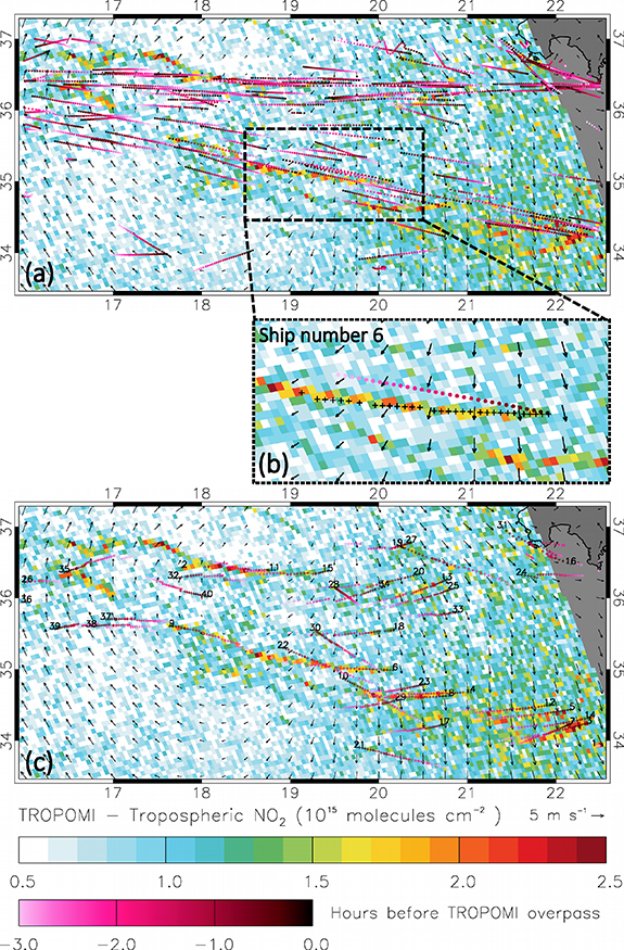
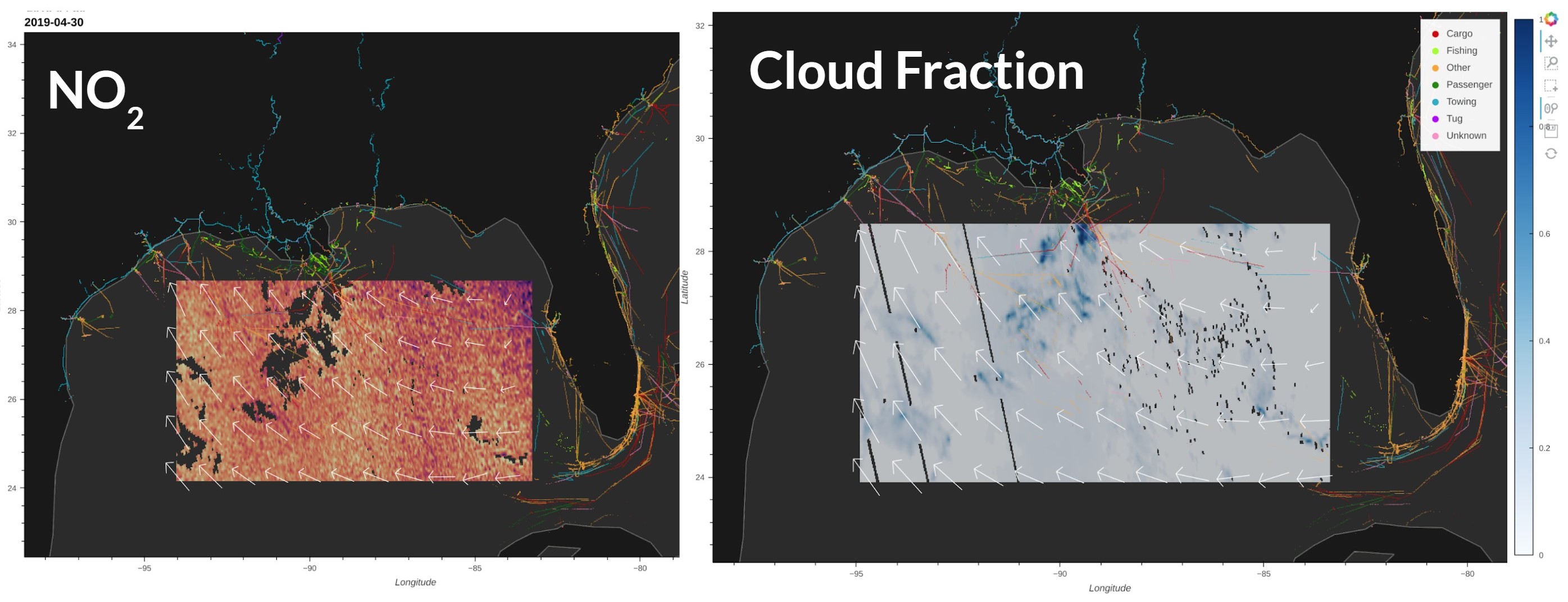
We have developed a new visualization tool to combine TROPOMI NO2 column density, ERA5 10m wind, and AIS ship data (5 hours before TROPOMI overpass time).
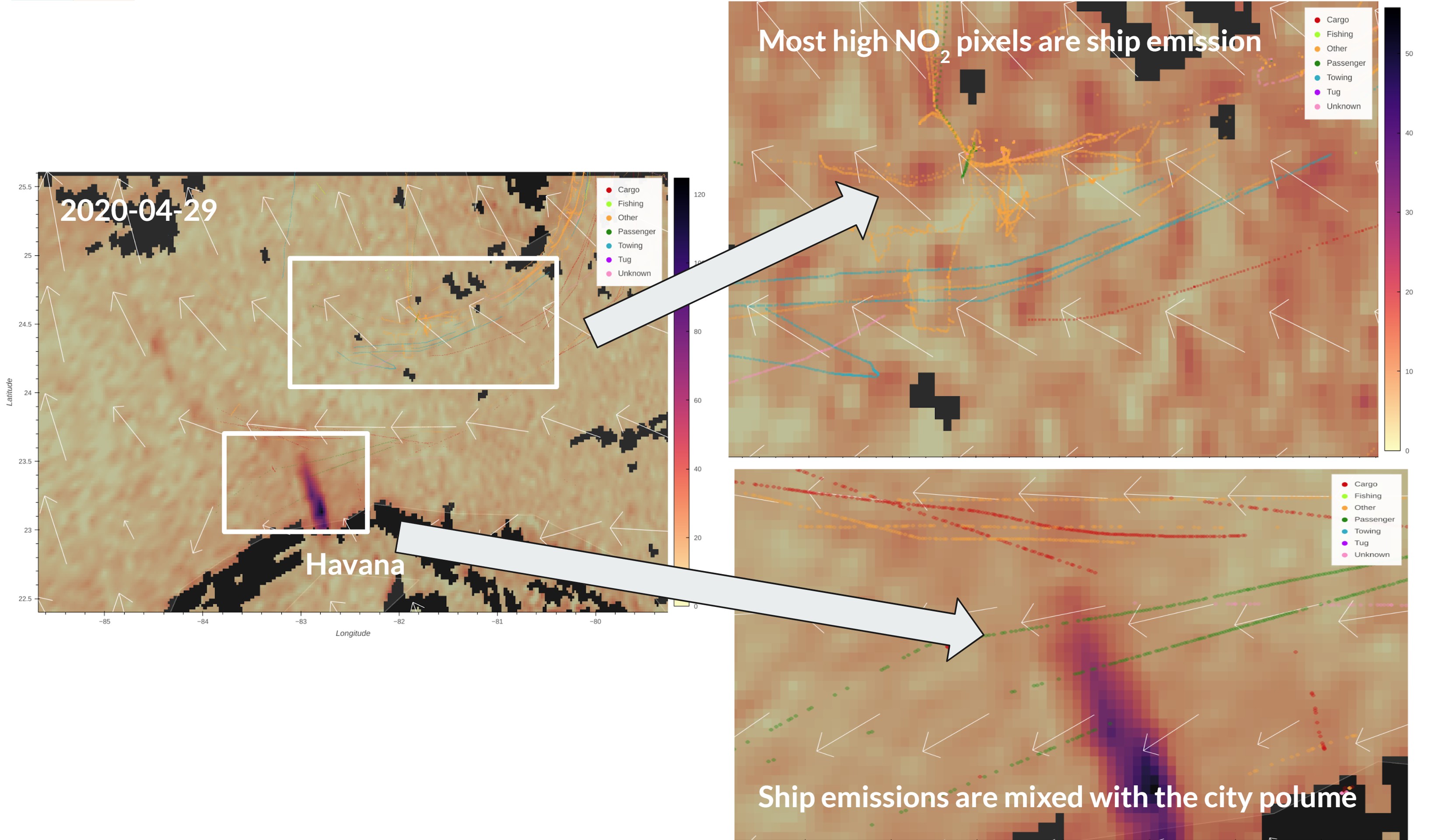
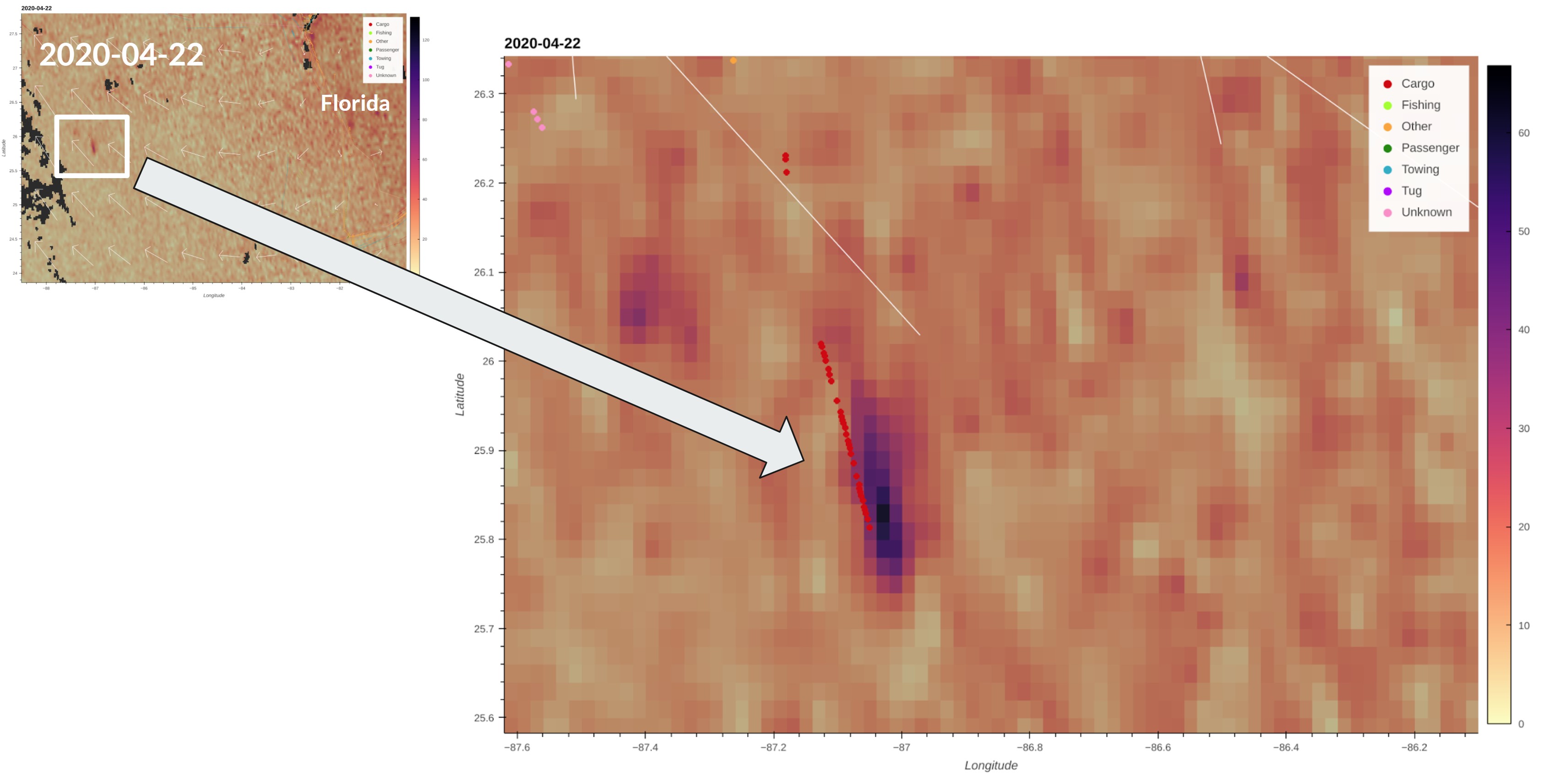
Ship emission can be clearly seen in the “clean” ocean.
Coastal NO2 emission can cover the NO2 emitted by ships.
Clouds can lead to many missing pixel values (empty/transparent squares).
Effects of ship type on NO2 pollution
As the interactive tool provides the ship type information, it can give scientists a new view of the ship emission, especially for different ship types.
- The “Cargo” type ship may generate large NO2 pollution.
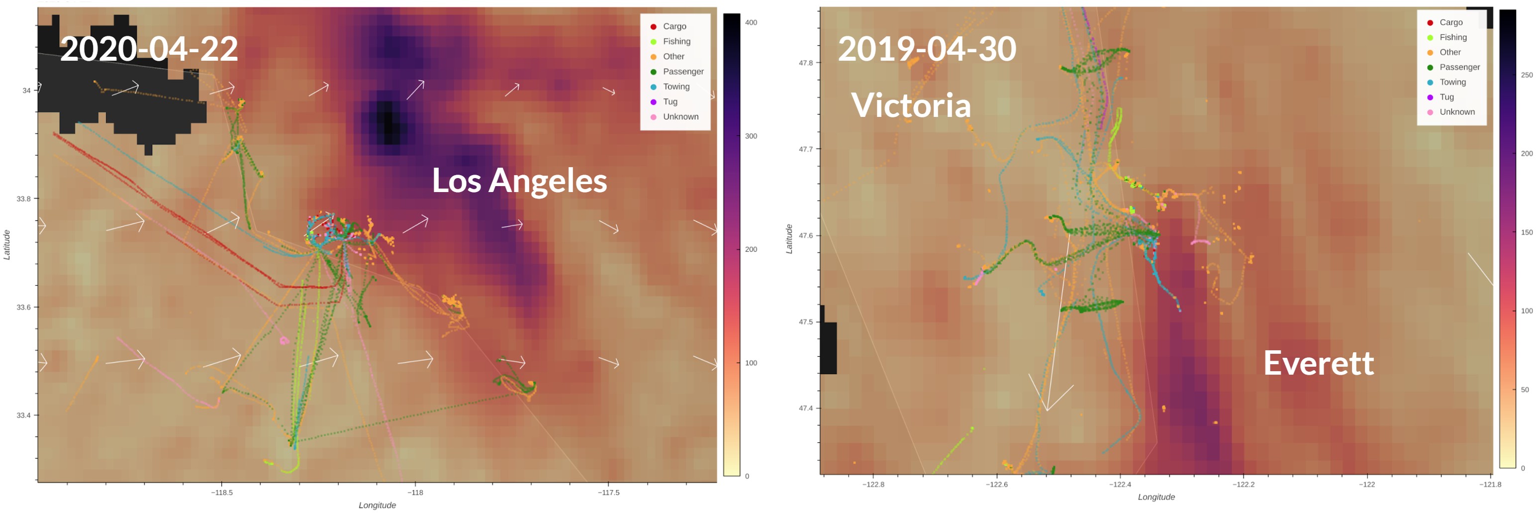
Effects of ship emission on populated area
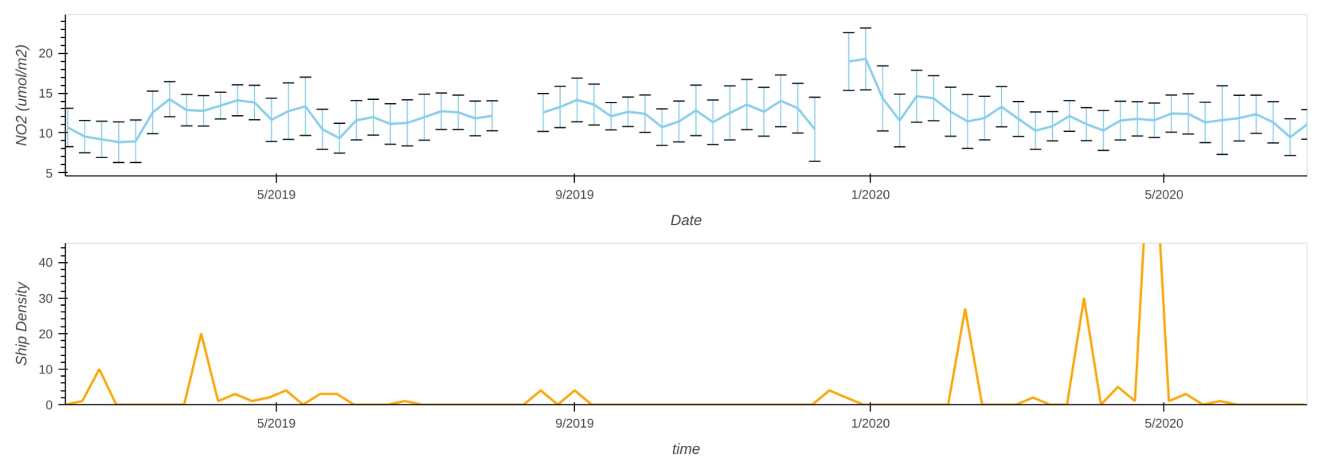
The lower city NO2 emission during the pandemic makes the ship NO2 emission more obvious.
- Because of the COVID-19, the ship emission can be partly seen near the populated cities, such as Los Angeles.
- The NO2 generated by ships over the busy ports can be diluted by wind and bring to downwind cities.
Cases
The example animation of visualization tool is saved on the GitHub.
You can execute the Jupyter Notebook on the Euro Data Cube to check interesting cases by yourself:
Applications
As shown by the ERL and GMD paper, the NO2 pollution plumes from ships can be detected by TROPOMI and simulated with new model. Our visualization tool can help scientists distinguish the NO2 plume more easily and quickly.